Thursday, February 3, 2011

Study of Propaganda

Propaganda images & links:


Green Patriot posters is a huge collection of User-submitted environmental awareness posters. Full of very clean and concise contemporary graphic design: http://www.greenpatriotposters.org/posters/index.php?p=425&sort=tr

---


This photo is not a propaganda image itself, but it relates to the current political attitude. Why take your eyes off the screen when you got one in your pocket? The US government and media work together to foster an atmosphere full of intellectual diversions and dead-ends.

---

Simply googling "Star Wars propaganda posters" reveals a trove of funny, novel, and vaguely political propaganda posters.


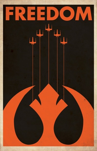
They aesthetics range from minimalists and beautiful to tacky and cartoon-like.


What's interesting to me is the rich political iconography that George Lucas has included in his films. Seeing the trilogy as a young boy, I didn't understand the full significance of Luke & "The Rebel Alliance"s struggle against "The Empire." Its likely Lucas used intentionally ambiguous titles such as these, and he even provided symbols to represent each side of this battle.

Rebel Alliance:


Imperial:


I have also uploaded a powerpoint of Russian and other propaganda images which you may find here (for now): http://www.mediafire.com/?z2xlroiege4o3lx

Wednesday, February 2, 2011

William Blake, Mark Titchner, Stefan Bruggemann

Text & Image Artists

William Blake was a Romantic G:


http://www.dailyartfixx.com/wp-content/uploads/2009/11/blake_william_nebuchadnezzar.jpg


http://www.arthistoryarchive.com/arthistory/romanticism/images/WilliamBlake-Jerusalem-Plate-33-1820.jpg


http://nickbaines.files.wordpress.com/2009/07/jerusalem-william-blake.jpg

Mark Tichner is a Photoshop G:


Most of his work features these short motivational speeches, with a very angular, blocky type. What's interesting is the way he photoshops the images past the point of absurdity. The average viewer, who is accustomed to varying amounts of photoshoppy effects applied to nearly everything in our visual culture, is overwhelmed with the plethora of intersecting and disappearing lines and colors but is obligated to look at the same time. The exact sort of sublimity and energy that advertisers hope to achieve with photoshop is what Titchner harnesses to send progressive and semi-critical messages. This puts him in the same general movement of Banksy and Shepard Fairey; that is, the artists devoted towards the battle against the massive media takeover of American culture and proliferation of advertising therein.

Stefan Bruggemann is the Gangsta of satire:


I interpret this second example to be poking fun at the simple aesthetics of the conceptualism in the 60's. But 50 years later, we're still just as lost as a young Donald Judd in the matrix of post-modernism.


Neon is a popular way to make text and specific letterforms look way cool.